Blog > Design
What Are the Best Fonts and Colors to Avoid the AI Look on a SaaS Landing Page?
Discover 5 SaaS font and color combinations that avoid the generic AI look, with hex codes, CSS variables, and Tailwind tips.
- Author
- Unslop UI
- Published
- Nov 11, 2026
- Updated
- Nov 12, 2026
- Read time
- 10 min read
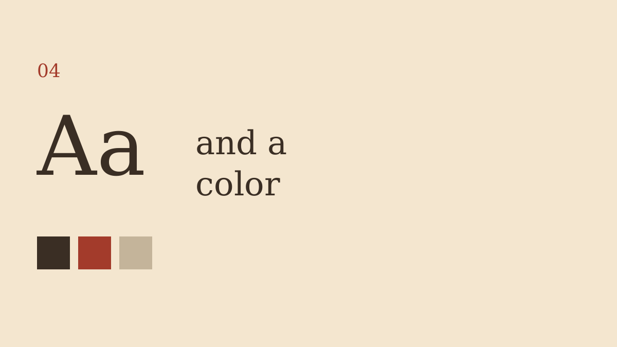
The best way to avoid the AI-generated look on a SaaS landing page is to replace the default Inter or Geist typography, purple-blue gradients, and generic gray UI with a deliberate font pairing and a restrained color palette. Try Instrument Serif with DM Sans on warm white (#F7F5F0), charcoal (#252722), and terracotta (#B46F4D). Use one consistent accent color, clear typography, and fewer decorative cards instead of adding more visual effects.
You don't need an unusual design. You need a design that looks like someone made intentional choices.
Why do Inter, Geist, and purple gradients make SaaS websites look AI-generated?
The problem isn't Inter. Or Geist. Or purple.
The problem is how often they appear together.
A familiar AI-looking SaaS landing page usually has:
- Inter or Geist for every heading, paragraph, and button.
- A purple-to-blue gradient behind an oversized centered headline.
- Zinc-gray backgrounds and rounded cards.
- Three feature cards directly below the hero.
- A bento grid with glowing borders or glass effects.
- Copy like "The future of productivity starts here."
None of these choices is automatically bad. But combining them without a clear reason creates a design that resembles countless other template-based pages.
Inter is a good font. It's just a common default.
The same goes for shadcn components. They provide a useful foundation, but leaving their visual defaults untouched can make otherwise different products look similar.
Before:
- Font: Inter everywhere.
- Hero: Centered headline, gradient background.
- Features: Three identical rounded cards.
- CTA: Bright blue button.
- Heading: "Make Your Workflow Smarter."
After:
- Headline: Instrument Serif, 64px.
- Body: DM Sans, 16px.
- Background:
#F7F5F0. - Text:
#252722. - Accent:
#B46F4D. - Heading: "Spend less time chasing project approvals."
The second version has a stronger visual direction and a more specific message.
What are the five best font and color combinations for a SaaS landing page?
Here are five ready-to-copy design kits. Each includes a headline font, body font, five hex colors, and CSS variables.
Choose one kit rather than mixing every appealing color together.
Kit 1: Warm minimalism — Instrument Serif + DM Sans
Best for: Independent SaaS products, productivity tools, and founder-led businesses.
| Hex | Role |
|---|---|
#F7F5F0 | Background |
#252722 | Text |
#606C38 | Muted |
#B46F4D | Accent |
#E7E2D9 | Border |
Instrument Serif gives large headings a recognizable editorial character. DM Sans keeps navigation, buttons, and paragraphs easy to read.
Use Instrument Serif for a 56–72px desktop headline, then DM Sans at 16px for body text. Keep the hero on a warm-white background with no gradient.
:root {
  --background: #F7F5F0;
  --foreground: #252722;
  --muted-foreground: #606C38;
  --brand-accent: #B46F4D;
  --border: #E7E2D9;

  --font-heading: "Instrument Serif", serif;
  --font-body: "DM Sans", sans-serif;
}
Use the terracotta accent for decorative details and large emphasis, not for small body text on the warm background (about 3.6:1). This is the kit I'd start with if a SaaS homepage feels like a default AI template.
Kit 2: Warm editorial — Newsreader + Plus Jakarta Sans
Best for: Writing tools, research products, and SaaS brands built around thoughtful content.
| Hex | Role |
|---|---|
#FBF9F5 | Background |
#1C1917 | Text |
#606C38 | Muted |
#C85A32 | Accent |
#E7E2D9 | Border |
Newsreader brings a quieter, publication-like feel to headlines. Plus Jakarta Sans provides a clean contrast for UI labels and body copy.
Try a 60px Newsreader heading, 18px introductory paragraph, and 16px supporting text.
:root {
  --background: #FBF9F5;
  --foreground: #1C1917;
  --muted-foreground: #606C38;
  --brand-accent: #C85A32;
  --border: #E7E2D9;

  --font-heading: "Newsreader", serif;
  --font-body: "Plus Jakarta Sans", sans-serif;
}
Use terracotta for icons, illustrations, or large emphasis rather than ordinary text (about 4.0:1 on this cream). For small CTA labels, a dark button with cream text is easier to keep accessible. Avoid surrounding every section with a card.
Kit 3: Retro-industrial technology — Space Mono + Instrument Sans
Best for: Developer tools, infrastructure products, and technical SaaS.
| Hex | Role |
|---|---|
#121316 | Background |
#FBF9F5 | Text |
#E7E2D9 | Muted |
#D1FF48 | Accent |
#77796D | Border |
A dark landing page doesn't have to use glowing purple or cyan. Use Space Mono for short headings, metrics, and labels, and keep longer paragraphs in Instrument Sans. The chartreuse accent contrasts clearly without a gradient.
:root {
  --background: #121316;
  --foreground: #FBF9F5;
  --muted-foreground: #E7E2D9;
  --brand-accent: #D1FF48;
  --border: #77796D;

  --font-heading: "Space Mono", monospace;
  --font-body: "Instrument Sans", sans-serif;
}
Try 48–56px headings and one solid accent button using #121316 for its label (about 16:1). Don't make every paragraph monospaced.
Kit 4: Boutique paper and ink — Fraunces + Satoshi
Best for: Premium-feeling tools, creative products, and focused SaaS brands.
| Hex | Role |
|---|---|
#FBF9F5 | Background |
#0F291E | Text |
#606C38 | Muted |
#B46F4D | Accent |
#E7E2D9 | Border |
Fraunces adds character to the headline without demanding unusual layouts. Satoshi keeps the rest of the interface straightforward. Satoshi is licensed through Fontshare under the Indian Type Foundry's ITF Free Font License. It is free for personal and commercial use, including self-hosting on your own site. You may not modify or redistribute the font files; download them from Fontshare.
Use the forest-green text prominently, and keep terracotta for supporting details rather than small body copy.
:root {
  --background: #FBF9F5;
  --foreground: #0F291E;
  --muted-foreground: #606C38;
  --brand-accent: #B46F4D;
  --border: #E7E2D9;

  --font-heading: "Fraunces", serif;
  --font-body: "Satoshi", sans-serif;
}
Try a 64px hero heading with a restrained line length and a solid forest-green CTA. Keep borders thin and avoid unnecessary shadows. The goal is a page that feels composed, not decorated.
Kit 5: Navy and safety orange — Sora + DM Sans
Best for: Analytics products, technical platforms, and bold contemporary SaaS.
| Hex | Role |
|---|---|
#0B192C | Background |
#FBF9F5 | Text |
#E7E2D9 | Muted |
#FF5C00 | Accent |
#77796D | Border |
Sora creates a strong, contemporary headline. DM Sans balances it with readable supporting text. The navy background provides depth without a purple glow, and orange gives the primary action a clear focal point.
:root {
  --background: #0B192C;
  --foreground: #FBF9F5;
  --muted-foreground: #E7E2D9;
  --brand-accent: #FF5C00;
  --border: #77796D;

  --font-heading: "Sora", sans-serif;
  --font-body: "DM Sans", sans-serif;
}
Try a 56px headline and one prominent orange CTA with navy text (about 5.7:1). Use neutral borders instead of glowing outlines. The accent should guide attention, not appear on every component.
Which font pairing should I choose for my SaaS?
| If you want... | Headline font | Body font |
|---|---|---|
| Warm and distinctive | Instrument Serif | DM Sans |
| Editorial and thoughtful | Newsreader | Plus Jakarta Sans |
| Technical and structured | Space Mono | Instrument Sans |
| Boutique and premium | Fraunces | Satoshi |
| Bold and contemporary | Sora | DM Sans |
A practical rule: choose one expressive headline font and one readable body font. Don't confuse distinctive with unusual.
How do I replace Inter and purple gradients in Tailwind or shadcn in 10 minutes?
Start with the CSS variables rather than editing every component.
Step 1 — Choose one kit. Copy its variables into your global CSS file, typically app/globals.css or src/index.css. Replace existing values rather than stacking multiple :root definitions.
Step 2 — Load the fonts. Add the two chosen fonts through your project's font-loading setup. Instrument Serif, DM Sans, Newsreader, Plus Jakarta Sans, Space Mono, Instrument Sans, Fraunces, and Sora are available on Google Fonts. Satoshi is not. It is distributed by Fontshare under the ITF Free Font License, which allows personal and commercial use, including self-hosting, but does not allow modifying or redistributing the font files. If you want a Google Fonts-only pairing for Kit 4, use Fraunces with Plus Jakarta Sans or DM Sans instead.
Step 3 — Apply the typography.
body {
  background: var(--background);
  color: var(--foreground);
  font-family: var(--font-body);
  font-size: 1rem;
  line-height: 1.6;
}

h1, h2, h3 {
  font-family: var(--font-heading);
}

h1 {
  font-size: clamp(2.5rem, 5vw, 4.5rem);
  line-height: 1.1;
}
Step 4 — Map your Tailwind tokens. For a Tailwind v4 setup, an example mapping is:
@theme inline {
  --color-background: var(--background);
  --color-foreground: var(--foreground);
  --color-muted-foreground: var(--muted-foreground);
  --color-brand: var(--brand-accent);
  --color-border: var(--border);
}
In shadcn, also review --primary, --primary-foreground, --muted, --muted-foreground, and --border. The five-color kits aren't complete drop-in shadcn themes. For the warm minimalist kit, a dark primary button can use:
:root {
  --primary: #252722;
  --primary-foreground: #F7F5F0;
}
Step 5 — Remove the obvious defaults. Replace the purple gradient with a solid background, remove unnecessary glow effects, and reconsider the centered hero plus three identical feature cards. A small landing page can be updated quickly; a larger project may take more component work.
How do I keep the new colors accessible?
A distinctive color palette is useless if visitors can't read it.
WCAG AA calls for at least 4.5:1 contrast for normal text and 3:1 for qualifying large text. W3C's WCAG guidance and MDN's color accessibility documentation are useful references.
Computed contrast for these kits (text on background):
#252722on#F7F5F0is about 13.85:1 (Kit 1 body text; passes AA).#606C38on#F7F5F0is about 5.2:1, and on#FBF9F5about 5.4:1 (muted text; passes AA).#B46F4Don#F7F5F0is about 3.6:1, and#C85A32on#FBF9F5is about 4.0:1 (fail AA for small text; fine as large display or decoration).#0B192Con#FF5C00is about 5.7:1 (Kit 5 navy label on the orange button; passes AA).#121316on#D1FF48is about 16:1 (Kit 3 label on the chartreuse button; passes AA).
Don't assume a color works for small text simply because it looks good as an accent. Check buttons, disabled states, muted labels, and hover states separately.
What else should I change besides fonts and colors?
Fonts and colors are only part of the AI look.
After updating the palette, review these design decisions:
- Replace vague headlines with specific product outcomes.
- Avoid automatically centering every section.
- Remove cards where a simple layout would work.
- Use one consistent accent instead of multiple competing gradients.
- Keep headings, buttons, and spacing consistent.
- Check mobile typography and contrast.
- Review the complete page, not just the hero section.
You can paste your URL into Unslop UI for a free screenshot-based scan. It flags visual AI-look patterns, gives a score, and identifies what to fix, which helps you check whether template signals remain after the font and color changes.
FAQ: What do founders ask about avoiding the AI look?
What are the best fonts and colors to avoid the AI look on a SaaS landing page?
Start with Instrument Serif for headlines, DM Sans for body text, warm white #F7F5F0, and charcoal #252722. Use terracotta #B46F4D sparingly and avoid default purple-blue gradients.
How do I fix the generic Inter font and purple gradient look on my SaaS landing page?
Replace Inter-only typography with a two-font system, such as Newsreader and Plus Jakarta Sans, and use a solid cream background instead of the gradient. Then simplify repetitive cards, glowing borders, and generic hero copy.
Is Inter a bad font for SaaS websites?
No. Inter is readable and useful for interfaces, but using it everywhere with default template styling can make a page feel generic. You can keep Inter for functional UI text and use a more expressive headline font.
Should I use a dark or light background for my SaaS landing page?
Both can work. Light cream backgrounds suit editorial or approachable designs, while dark slate or navy can work for technical products; the important part is consistent typography, restrained accents, and readable contrast.
What is the best alternative to purple gradients for an AI SaaS website?
Try warm cream with terracotta, forest green on linen, or dark slate with chartreuse. One solid accent color often creates a clearer hierarchy than several competing gradient effects.
How can I tell if my SaaS landing page still looks AI-generated?
Look for repeated patterns such as default fonts, centered hero sections, three identical feature cards, bento grids, and purple-blue gradients. Run a free scan at Unslop UI (unslopui.org) to see which visual AI-look signals are flagged and what to fix next.